Though functionally rich, PayBox’s experience is cluttered and confusing
Users struggle to complete basic tasks like sending money or tracking group contributions
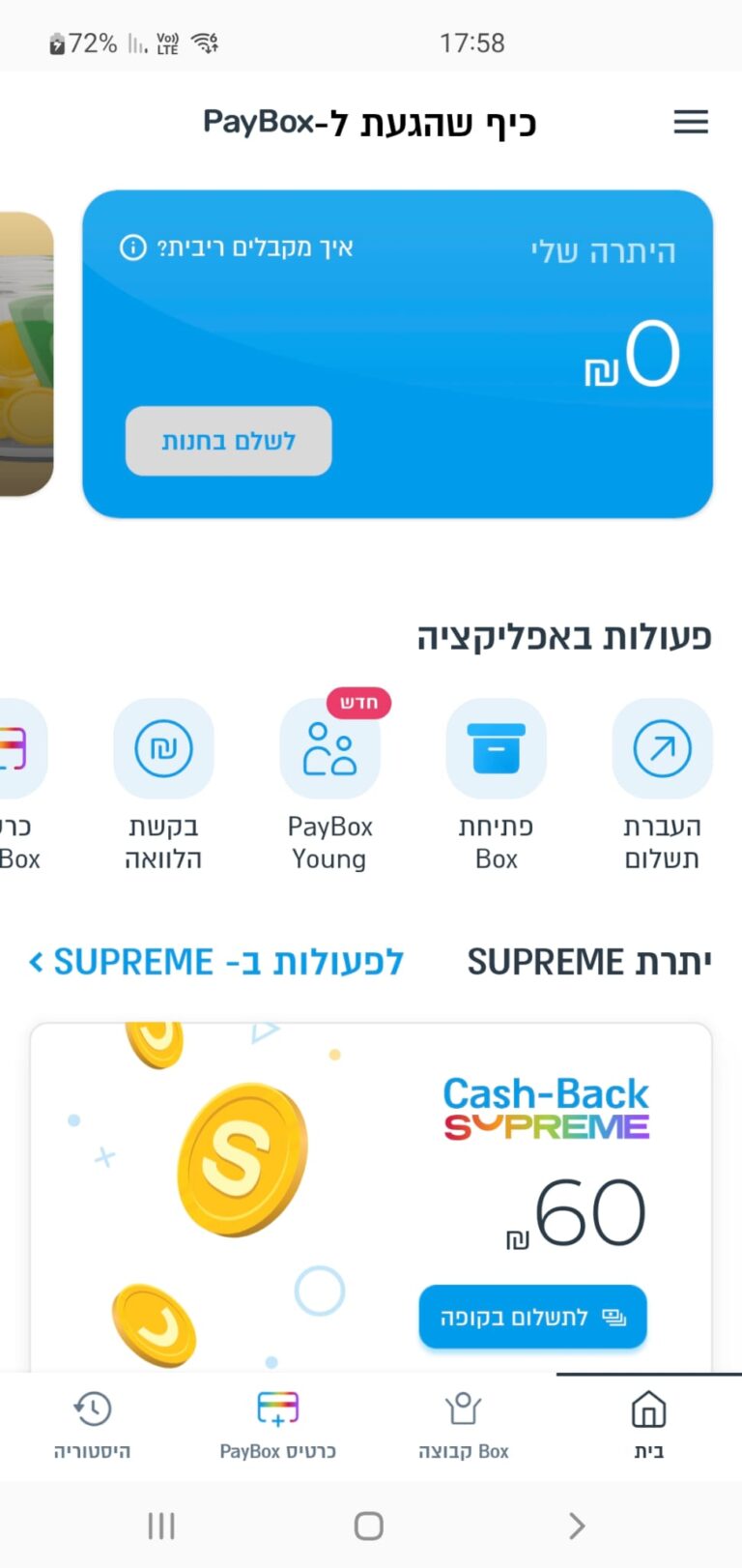
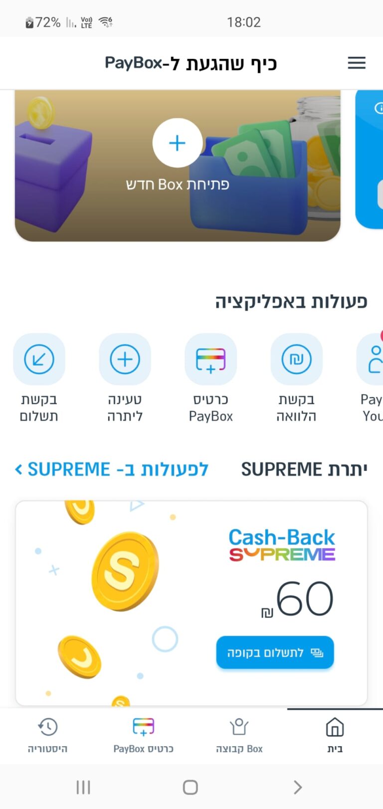
The problem: Too Many Taps, Not Enough Clarity
A crowded home screen. Too many CTAs
Missing guidance. easy to get lost
Unclear payment status
It’s the most powerful app for group payments in Israel, but when it comes to ease of use, Bit and Pepper win
The competition: PayBox Leads in Features, Lags in Clarity
Loading..........
The Data is Not Available
Loading..........
The Data is Not Available
Research: Users Want to Pay, Not Navigate.
Using GPT to analyze competitor reviews, features, and tools, along with app store reviews, 10 user interviews, and usability testing, I found that users don’t want more features. They want faster, clearer ways to pay.
"The tracking payments is unclear. I revert to Excel to manage who paid and who didn’t."
"Just Focus on frequent tasks like "Send" or "Request" money."
What do users primarily use PayBox for?
No Data Found
No Data Found
What do users find confusing or frustrating?
No Data Found
No Data Found
Persona 1: “The Casual Splitter”
“I just want to pay my friends back quickly”
Tomer
A young professional. Often splits costs with friends: drinks, dinners, shared cabs, or rent with roommates.
Pain Points
1. Friction when friends don’t use the app
2. Confusing interface when requesting money
Goals
1. Instantly pay friends and get paid back
2. Have a record of who paid what
Persona 2: “The Group Organizer”
"Collecting money from people feels like a full-time job”
Maya
A go-to person for organizing gifts in her kid’s class, managing birthday collections at work. etc.
Pain Points
1. Overwhelmed tracking of small payments
2. Lacks control over messages and reminders
Goals
1. Create a payment link easily and share it
2. Track who paid and send polite reminders
SWOT Analysis
Advantages:
Strong brand in Israel
Group collection features
Free, bank-integrated
Opportunities:
Simplify + modernize UX
Onboard younger users
Disadvantages:
Crowded UI
Poor hierarchy
Vague messaging
Threats:
Bit & Pepper Pay adoption
Trust loss from confusion
Insights: One App, Two Different Journeys
Tap. Done. Gone.
Peer-to-peer users want a payment experience quick and casual
Make Managing Money Painless
Organizers want clarity and control and follow up without stress
Different Needs, Same App
Each audience expects the app to flex around their goals
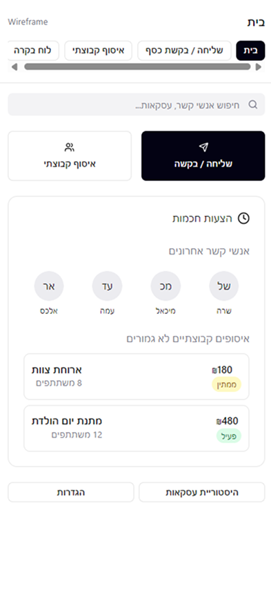
Flow: Simplifying Money: From Instant Sends to Group Collections
1. Show only 3 primary actions: “Send”, “Request”, and “Your Groups”
2. One action per screen In the Send screen: you only see the amount input, contact selection, and the “Send” button. No upsells, banners, or gifting suggestions.
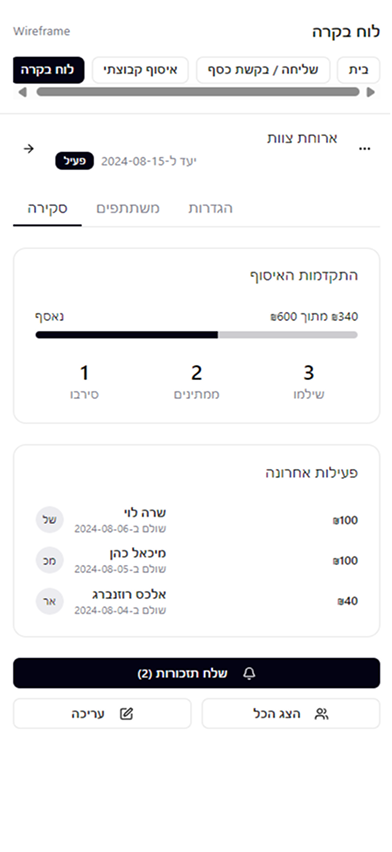
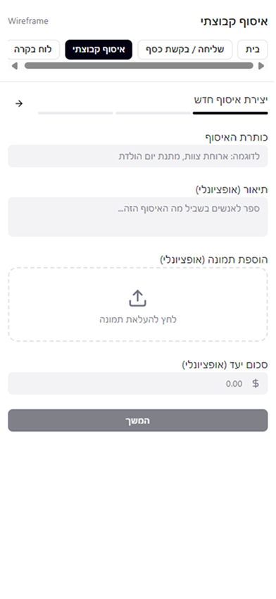
Main Screens for Effortless Payments and Organized Collections
Designed in Figma Make, the streamlined interface supports both quick peer-to-peer transfers and group management.
Conclusion: Designing Simplicity Into Every Flow
Redesigning PayBox demonstrated how effective UX simplifies everyday payment tasks. By applying AI-driven insights and AI-assisted design tools, I transformed complex flows into clear, intuitive experiences, highlighting that effective design prioritizes user experience over aesthetics.